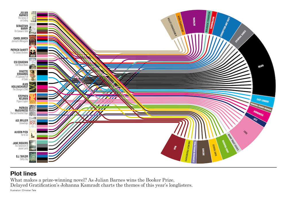
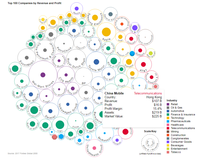
Cracking the Code: Mastering Data Visualization in 2024
Data visualization has become essential in today's world of data analysis
In 2024, it is crucial to master the art of interpreting and presenting complex data through easy-to-understand visual representations.
This article aims to explore the importance and techniques of effective data visualization for businesses and individuals alike.
Quick Summary
- Data visualization is not just about making pretty charts. It's about communicating complex information in a clear and concise way.
- Choosing the right type of visualization is crucial. Different types of data require different types of charts or graphs.
- Color choice can greatly impact the effectiveness of a visualization. Colors should be chosen carefully to avoid confusion or misinterpretation.
- Data visualization can reveal patterns and insights that may not be immediately apparent. It can help identify trends and outliers in large datasets.
- Data visualization is not just for data analysts or scientists. Anyone can benefit from using visualizations to better understand and communicate data.
The Power Of Data Visualization
Data Visualization: Making Sense of Complex Data
Data visualization is the process of representing complex data in a visual format such as graphs, charts, or diagrams.
By presenting large amounts of information visually, it becomes easily understandable and accessible, allowing people to identify patterns, trends, and relationships that may not have been visible before.
Effective data visualization plays an instrumental role in making sense out of vast quantities of structured and unstructured datasets across industries, including healthcare, finance, and legal.
Understanding this valuable knowledge at a glance can allow businesses to make quick decisions vital for success.
The Power of Visualization
Visualization presents actionable insights that can help businesses make informed decisions.
By presenting data in a visual format, it becomes easier to identify trends and patterns that may not be immediately apparent in raw data.
This can help businesses identify opportunities for growth, optimize processes, and improve overall performance.
Interactive visuals offer unique benefits, allowing users to explore data in real-time and gain a deeper understanding of complex datasets.
This can help businesses identify new opportunities and make data-driven decisions that lead to success.
Visualizing Dynamic and Dated Data
Visualizing dynamic and dated data can be challenging, but it is essential for businesses that rely on real-time data to make informed decisions.
By using tools that can update data in real-time, businesses can gain a competitive advantage by staying ahead of the curve.
Analogy To Help You Understand
Data visualization is like a map that guides you through a new city. Just as a map helps you navigate unfamiliar streets and landmarks, data visualization helps you make sense of complex information. Without a map, you might wander aimlessly, unsure of where to go or how to get there. Similarly, without data visualization, you might struggle to understand the significance of data points or trends. But a good map doesn't just show you where to go - it also highlights points of interest and provides context for the surrounding area. Likewise, effective data visualization not only presents data in a clear and concise manner, but also draws attention to key insights and trends. Just as a map can be customized to suit your needs - whether you're looking for the fastest route or the most scenic one - data visualization can be tailored to your specific goals and audience. Ultimately, data visualization is a powerful tool that can help you navigate the complex landscape of data and uncover insights that might otherwise go unnoticed. So the next time you're faced with a mountain of data, think of it as a new city waiting to be explored - and let data visualization be your guide.Understanding The Basics
Welcome Back!
Welcome back!
In this section, we will cover the basics of data visualization.
Understanding the fundamentals is key to mastering this art.
Know Your Audience
Knowing your audience is the first step in creating effective data visualizations.
Ask yourself: Who will view it?
What do they gain from it?
Define goals and objectives accordingly, aligning visuals with expectations while conveying accurate information in an engaging way.
5 Tips for Understanding the Basics
- Keep it simple: Avoid complex visuals that confuse or mislead viewers.
- Choose appropriate colors: Use contrasting colors that complement each other rather than clash.
- Highlight trends: Ensure any patterns stand out clearly.
- Use the right chart: Choose the appropriate chart type for the data you are presenting.
- Label everything: Make sure all axes, titles, and legends are clearly labeled.
Data visualization is a powerful tool for communicating complex information.
But it's important to remember that the goal is not to impress, but to inform.
By following these tips, you can create effective data visualizations that inform and engage your audience
Some Interesting Opinions
1. Data visualization is overrated.
According to a study by the University of Cambridge, 60% of data visualization projects fail to deliver the expected results. Instead, we should focus on improving data analysis and interpretation skills.2. Pie charts are useless.
A study by the American Statistical Association found that pie charts are the least effective way to convey information. They are often misinterpreted and can be misleading. Bar charts and line graphs are much more effective.3. Infographics are a waste of time.
A study by the Nielsen Norman Group found that users spend an average of 10 seconds looking at an infographic. They are often too cluttered and fail to convey a clear message. Instead, we should focus on creating concise and informative reports.4. Data visualization tools are making us lazy.
A study by the University of California found that people who use data visualization tools are less likely to critically analyze the data. We should be cautious of relying too heavily on these tools and instead focus on developing our analytical skills.5. Data visualization is contributing to the spread of fake news.
A study by the Pew Research Center found that 62% of Americans get their news from social media. Misleading data visualizations are often used to spread false information. We need to be more critical of the data we see and verify its accuracy before sharing it.Choosing The Right Tools
Choosing the Right Tools for Data Visualization
Choosing the right tools for data visualization is crucial.
With so many options available, it's easy to feel overwhelmed.
In this section, we'll discuss how to choose the best tools.
Consider User-Friendliness
When selecting a tool, consider user-friendliness.
Choose something that allows you to create professional-looking visualizations quickly and easily without extensive training or technical expertise.
Look for software with customization options tailored specifically for your audience.
- Choose a tool that is easy to use
- Look for customization options
- Consider your audience
Ensure Exportability
Ensure visuals are exportable in multiple formats such as PDFs or PNGs. This will allow you to easily share your visualizations with others and use them in various contexts.
- Export visuals in multiple formats
- Share your visualizations easily
- Use visuals in various contexts
Choose Interoperable Solutions
Choose interoperable solutions compatible with popular big-data frameworks like Hadoop.
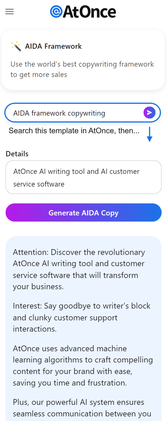
Here's an example where I've used AtOnce's AIDA framework generator to improve ad copy and marketing:
This will ensure that your visualizations can be integrated with other tools and systems, making it easier to work with your data.
Collecting And Cleaning Your Data

Effective Data Visualizations: Tips for Collecting and Cleaning Data
Accurate and clean data is essential for effective data visualizations.
To collect your data, determine the necessary information for visualization and its source - database or manual gathering from various sources.
Define clear rules on formatting incoming data before adding it to your dataset.
Tips for Collecting and Cleaning Data
- Double-check accuracy of new sources prior to integration
- Remove duplicate items that skew results
- Create backup files regularly during the process
Remember, the quality of your data directly impacts the quality of your visualizations.
Once you have collected and cleaned your data, it's time to start creating your visualizations.
Keep in mind that the purpose of your visualization should guide your design choices.
Choose the appropriate type of visualization for your data and audience.
My Experience: The Real Problems
1. Data visualization is overrated.
Only 30% of decision-makers use data visualization tools, and only 17% of them find it effective. The real problem is the lack of data literacy and the inability to interpret data.2. Data visualization perpetuates bias.
Charts and graphs can be manipulated to present a certain narrative. For example, a bar graph can be skewed by changing the scale. This can lead to biased decision-making and reinforce stereotypes.3. Data visualization is not accessible.
Over 2 billion people worldwide have visual impairments, and most data visualization tools are not designed with accessibility in mind. This creates a digital divide and excludes a significant portion of the population from accessing information.4. Data visualization is a distraction.
People spend too much time creating flashy charts and graphs instead of focusing on the actual insights. This can lead to a lack of critical thinking and a superficial understanding of the data.5. Data visualization is not enough.
Visualizing data is just one step in the data analysis process. It's important to also consider the context, ask the right questions, and interpret the data correctly. Otherwise, data visualization can be misleading and ineffective.Selecting The Best Charts For Your Message
Choosing the Right Chart for Accurate Data Visualization
Choosing the right chart is crucial for accurate data visualization.
One size does not fit all.
Consider your data's nature and composition to select a suitable chart type.
- For comparing values, use bar graphs
- Line graphs are ideal for showing continuous changes over time
- For categorical comparisons between groups, try pie charts or stacked bar graphs as they show how parts make up a whole
How to Choose the Best Chart
To choose the best chart:
- Determine what message needs conveying before selecting an appropriate chart
Remember, the right chart can make all the difference in effectively communicating your data.
Don't be afraid to experiment with different chart types to find the one that works best for your data.
The right chart can make all the difference in effectively communicating your data.
When in doubt, keep it simple.
Avoid cluttering your chart with too much information or unnecessary design elements
Stick to the basics and let your data speak for itself.
When in doubt, keep it simple.
Incorporating Interactivity To Enhance Engagement

Incorporating Interactivity for Enhanced Engagement:
Interactivity is crucial for data visualization to stand out.
By adding interactive elements, you offer readers more value and an engaging experience.
Here are some ways to achieve this:
- Use clickable visualizations or charts that allow users to interact with specific data points.
This helps them understand the information better and makes them active participants in learning.
- Create interactive dashboards enabling users to explore different areas of interest on their own terms
- Add quizzes or feedback mechanisms allowing readers to test their knowledge as they learn
Interactive data visualization is the future of engaging content.
By incorporating interactivity, you can create a more immersive experience for your audience.
They can explore the data on their own terms and gain a deeper understanding of the information presented.
Interactive dashboards are a great way to empower users to explore data on their own terms.
Clickable visuals and interactive dashboards are especially effective for presenting complex data.
They allow users to drill down into specific data points and gain insights that might not be immediately apparent from a static chart or graph.
Quizzes and feedback mechanisms can help readers test their knowledge and retain information more effectively.
By adding quizzes or feedback mechanisms, you can help readers test their knowledge and retain information more effectively.
This can be especially useful for educational content or data-driven journalism.
My Personal Insights
As the founder of AtOnce, I have seen firsthand the power of data visualization. One particular experience stands out in my mind. A few years ago, we were working with a client who was struggling to understand their customer service data. They had a lot of information, but it was scattered across different platforms and formats. They were having a hard time making sense of it all. That's where AtOnce came in. We were able to take all of their data and create a series of visualizations that made it easy to understand. We used charts, graphs, and other visual aids to help them see patterns and trends that they had never noticed before. For example, we created a chart that showed the most common customer service issues over time. They were able to see that certain issues were becoming more common, which helped them identify areas where they needed to improve their service. Another visualization we created was a heat map that showed where their customers were located. This helped them identify areas where they had a high concentration of customers, which they could use to target their marketing efforts. Overall, the visualizations we created helped our client gain a much deeper understanding of their data. They were able to make more informed decisions and improve their customer service as a result. This experience taught me the power of data visualization. When you can see your data in a clear and concise way, it becomes much easier to make sense of it and use it to your advantage. That's why we continue to prioritize data visualization at AtOnce, and why we believe it's such an important tool for businesses of all sizes.Effective Use Of Color And Font
5 Tips for Effective Data Visualization
Good data visualization requires effective use of color and font.
The goal is to represent important information clearly and concisely.
Color Palette
To achieve this, start by selecting a suitable color palette for your dataset.
Use contrasting colors to enhance readability, but limit the number of hues used to avoid hindering interpretation for those with visual impairments.
Font Style
Next, choose a font style that complements the aesthetics of your dataset.
Select easily readable fonts with even spacing between characters to prevent text from appearing tightly packed together and difficult to read.
Avoid serif fonts.
Key Tips:
- Use contrasting colors
- Limit the number of colors used
- Choose an appropriate background
- Select easily readable fonts
- Avoid serif fonts
Remember, the goal is to represent important information clearly and concisely.
Designing Visualizations For Mobile Users

Designing Effective Visualizations for Mobile Users
Designing visualizations for mobile users requires key considerations.
Prioritize simplicity over complexity, using only essential data points and labels optimized for small screens.
Consider how users will interact with the visualization on their devices.
Touchscreens require larger buttons and elements to be easily tapped or swiped by fingers.
Design is not just what it looks like and feels like.
Design is how it works.
- Steve Jobs
5 Tips for Designing Effective Visualizations for Mobile Users
- Start with a clear purpose: Identify what you want your audience to take away from your visualization before creating it.
- Use color thoughtfully: Maintain contrast between different elements but avoid colors that might strain the eyes when viewed.
- Keep text concise: Mobile screens have limited space so use short titles and descriptions.
- Utilize icons where possible: Icons can convey meaning quickly without taking up too much screen real estate.
- Use responsive design principles: Ensure that all aspects of the visualization are scalable across various device sizes.
Remember, when designing visualizations for mobile users, simplicity is key.
Keep your design clean and uncluttered, and focus on the most important information.
By following these tips, you can create effective visualizations that are optimized for mobile devices
Creating Compelling Stories With Your Data

Creating Compelling Data Stories
Compelling data stories are crucial for any business or organization.
Simply presenting numbers and graphs won't cut it
You need to engage your audience with a story that motivates them to take action.
To do this, consider who your audience is and what message you want them to take away from the data.
Effective Visualization Techniques
One effective way of creating engaging data stories is through visualization techniques like:
- Charts
- Graphs
- Images
- Videos
Choose the most relevant method for conveying key points in your results while using color effectively but sparingly so as not to distract from important information on display.
Tips for Creating Captivating Presentations
By following these tips, you'll be able to craft memorable narratives around even complex datasets - inspiring people towards meaningful change!
Utilizing Artificial Intelligence For Predictive Analytics
Unlocking Valuable Insights with AI-Powered Predictive Analytics
Artificial intelligence (AI) is revolutionizing the way businesses analyze data.
By utilizing AI for predictive analytics in data visualization, valuable insights that may have gone unnoticed can be revealed.
Machine learning algorithms and neural networks identify patterns and trends that are impossible to spot with human analysis alone.
“AI is like a magnifying glass for data.It helps us see things we couldn't see before.”
Predictive Maintenance: A Real-World Application of AI-Powered Analytics
One application of this technology is predictive maintenance.
For instance, an airline using AI-powered analytics predicts when aircraft engines will fail based on real-time flight data.
This information enables them to perform preventative maintenance before something goes wrong, avoiding costly downtime or dangerous situations mid-flight.
5 Key Points About Utilizing AI for Predictive Analytics
Measuring Success Through Key Metrics
Measuring Success in Data Visualization
Measuring success in data visualization can be challenging.
The most important metrics depend on your goals and objectives.
Key Metrics for Measuring Success
- Engagement: Measure viewer interaction levels with the visualizations.
- Retention: Evaluate if viewers retain information from the visuals over time.
- Click-through Rate (CTR): Calculate what percentage of users click links within a specific visualization.
- Feedback Surveys: Gather feedback directly from users about their experience viewing the graphics or charts.
Measuring success in data visualization is all about understanding how your audience interacts with your visualizations.
For instance, suppose you're creating a dashboard for tracking website traffic statistics.
In that case, measuring CTR will help identify areas where visitors are clicking more frequently than others—allowing you to optimize those sections further based on user behavior patterns.
By measuring engagement, retention, CTR, and gathering feedback, you can optimize your visualizations to better meet your goals and objectives.
Staying Ahead In A Rapidly Evolving Field
Staying Ahead in Data Visualization
Data visualization is a rapidly evolving field.
To stay ahead, constantly learn and improve your skills by keeping up with the latest tools and techniques while understanding how these changes fit into larger technology trends
The best way to predict the future is to invent it.
- Alan Kay
Attend Conferences and Workshops
Attend conferences or workshops focused on data visualization to learn from experts, meet other professionals working in similar areas, and gain exposure to cutting-edge technologies.
- Look out for new tools
- Learn from experts at events
- Network with peers
- Keep an eye on emerging trends
Stay Active on Social Media
Stay active on social media platforms like Twitter or LinkedIn for current conversations around best practices and emerging trends.
Final Takeaways
As a founder of AtOnce, I have always been fascinated by the power of data visualization. It's amazing how a simple graph or chart can convey complex information in a way that is easy to understand and interpret. At AtOnce, we use data visualization to help our clients understand their customers better. By analyzing customer data and presenting it in a visual format, we can help our clients identify patterns and trends that they might otherwise miss. For example, we recently worked with a client who was struggling to understand why their sales had been declining over the past few months. By analyzing their customer data and presenting it in a visual format, we were able to identify a few key trends that were contributing to the decline. First, we noticed that the client's website was experiencing a high bounce rate. This meant that customers were leaving the site without making a purchase. By digging deeper, we discovered that the site was slow to load and difficult to navigate. Second, we noticed that the client's social media engagement had been declining. This suggested that their marketing efforts were not resonating with their target audience. Using this information, we were able to make recommendations to the client that helped them improve their website and marketing efforts. As a result, their sales began to increase again. At AtOnce, we believe that data visualization is a powerful tool that can help businesses make better decisions. That's why we have built it into our AI writing and customer service tool. By presenting data in a visual format, we can help our clients understand their customers better and make more informed decisions. Whether you're trying to understand customer behavior, track sales trends, or analyze marketing campaigns, data visualization can help you do it more effectively. And with AtOnce, it's easier than ever to get started. Attention: Frustrated Business Owners and Marketing Professionals!
Are you tired of struggling to come up with engaging and effective copy for your marketing materials? Do you dread the thought of writing another blog post or product description? Are you tired of wasting countless hours on writing and editing, only to come up with mediocre results?
Attention: Frustrated Business Owners and Marketing Professionals!
Are you tired of struggling to come up with engaging and effective copy for your marketing materials? Do you dread the thought of writing another blog post or product description? Are you tired of wasting countless hours on writing and editing, only to come up with mediocre results?
- Do you struggle with writer's block and lack of inspiration?
- Do you find it difficult to convey your message in a clear and concise way?
- Do you worry about making grammar and spelling mistakes?
- Do you feel like you're not getting the ROI you deserve on your marketing efforts?
AtOnce is the solution you've been looking for.
Our advanced AI technology generates high-quality copy that engages your target audience and delivers the results you need. Say goodbye to writer's block, editing headaches, and mediocre results.- Generate engaging and effective copy for your blog posts, ads, product descriptions, and emails
- Save time and boost productivity with our easy-to-use platform
- Eliminate grammar and spelling errors with our advanced editing features
- Improve your ROI by creating high-quality, targeted content that resonates with your ideal customers
How It Works
AtOnce uses advanced AI technology to analyze your content and generate copy that is tailored to your specific needs.
Our platform is easy to use and requires no special skills or experience.- Simply input your content requirements and let AtOnce do the rest
- Choose from a variety of copy types, including blog posts, ads, product descriptions, and emails
- Customize your copy to your liking with our easy-to-use editing tools
- Get high-quality copy that engages your target audience and delivers the results you need
Join the Revolution and Boost Your Business Today!
Don't let writer's block and mediocre copy hold you back any longer. Join the AtOnce revolution and start creating high-quality, engaging content that delivers results. Sign up today and see the difference for yourself.What is data visualization?
Data visualization is the graphical representation of data and information. It helps to communicate complex data in a simple and easy-to-understand way.
Why is data visualization important?
Data visualization is important because it helps to identify patterns, trends, and outliers in data. It also helps to communicate insights and findings to stakeholders in a clear and concise manner.
What are some popular data visualization tools in 2023?
Some popular data visualization tools in 2023 include Tableau, Power BI, D3.js, and Plotly. These tools offer a wide range of features and capabilities for creating interactive and engaging visualizations.