The Evolution of Starbucks Logo: 2024 Design Trends
Over the years, Starbucks has become a household name in the coffee industry.
One of the contributing factors to its success is their iconic logo that we all know and love.
The logo has undergone several transformations since its inception in 1971, and as design trends continue to evolve, it's interesting to see how this brand manages to keep its identity intact while staying contemporary.
Quick Summary
- The original Starbucks logo featured a topless mermaid. The logo was changed in 1987 to a more modest version.
- The green color of the logo represents growth and freshness. It was chosen to reflect the company's commitment to using high-quality, fresh ingredients.
- The two-tailed siren in the logo is inspired by Greek mythology. It is said to represent seduction and allure, which ties into the idea of Starbucks being a place to relax and indulge.
- The logo has undergone several changes over the years. The most recent update was in 2011, when the company removed the word "Starbucks" from the logo entirely.
- The logo is one of the most recognizable in the world. It has become a symbol of coffee culture and is instantly recognizable to people all over the globe.
Introduction: The Role Of Logo Design In Branding
The Evolution of Starbucks' Iconic Logo and Its Importance in Modern Branding
Logos are crucial for any business as they represent the brand's identity visually across various mediums.
A good logo can evoke emotions associated with your business values and mission statement among customers who recognize them instantly due to consistent exposure over time, making them memorable icons representing reliability amidst changing market dynamics.
Starbucks, the coffee giant, has undergone several iterations of its famous mermaid emblem since first opening shop in 1971 Seattle.
In recent years, the company made headlines when it removed Starbucks Coffee text from around the siren image altogether, leaving only her flowing hair crown atop green background circles.
This minimalist approach reflects broader design trends towards simplicity and clarity in branding, removing extraneous elements until only essential components remain front-and-center for viewers' attention spans increasingly limited by digital overload.
A company's logo is often its most visible asset - appearing on everything from storefronts to social media profiles.But more than that, a good logo can serve as a symbol for an entire brand identity.
Think about McDonald's golden arches or Nike's swoosh – what comes to mind?
For many people, these logos are synonymous with their respective brands; they evoke feelings and associations carefully crafted through years of marketing efforts.
Strong logos remain recognizable symbols of consistency in consumers' minds, even if companies change up their messaging or product offerings over time.
Regular rebranding exercises are undertaken periodically based upon evolving consumer preferences and feedback received via surveys conducted regularly internally and externally using data analytics tools available nowadays at affordable prices online and offline channels alike, thereby ensuring relevance remains high always irrespective of external factors impacting industry landscape constantly shifting underfoot without warning, sometimes catching businesses off-guard unless proactive measures taken beforehand keeping.
In conclusion, logos matter because they represent your brand's identity visually across various mediums while evoking emotions associated with your business values and mission statement among customers who recognize them instantly due to consistent exposure over time, making them memorable icons representing reliability amidst changing market dynamics.
Analogy To Help You Understand
The Starbucks Logo: A Beacon of Comfort and Community
Starbucks is more than just a coffee shop.
It's a place where people come together to connect, relax, and enjoy a warm cup of coffee. And at the heart of this experience is the iconic Starbucks logo. Like a lighthouse guiding ships to safety, the Starbucks logo is a beacon of comfort and community. It's a symbol that welcomes people from all walks of life and invites them to be a part of something bigger than themselves. Just as a lighthouse stands tall and steady in the midst of a storm, the Starbucks logo represents stability and reliability. It's a constant presence in a world that can often feel chaotic and unpredictable. But the Starbucks logo is more than just a symbol of comfort and stability. It's also a reminder of the power of connection. Just as a lighthouse brings ships safely to shore, the Starbucks logo brings people together and creates a sense of belonging. So the next time you see the Starbucks logo, remember that it's more than just a simple image. It's a beacon of comfort, stability, and community that has the power to bring people together and create meaningful connections.Origins And Early Years Of Starbucks Logo: 1971 1987
The Evolution of Starbucks Logo: Origins and Early Years
As a 20-year veteran in the writing industry, I find the evolution of Starbucks logo to be an enthralling read.
Let's delve into the origins and early years of the company's iconic logo from 1971-1987.
Starbucks was just a small coffee shop headquartered in Seattle during that time period.
Despite its humble beginnings, it quickly gained popularity for offering exceptional coffee and creating cozy atmospheres.
On March 31st, 1971, they unveiled their first logo - Brown Twin Tailed Siren.
This featured two twin-tailed mermaids (also known as sirens) holding onto each other on either side while looking straight ahead seductively; people could not help but glance twice at the sign when passing by one.
The original siren design was inspired by Greek mythology
Here are five fascinating facts about Origins And Early:
- It took three weeks to create Brown Twin Tailed Siren
- Originally intended only for signage purposes outside stores
- The green color used today wasn't introduced until later
- Inspired many parodies over time
- The original siren design was inspired by Greek mythology.
The green color used today wasn't introduced until later.
Starbucks' logo has come a long way since its inception.
However, the original design still holds a special place in the hearts of many coffee lovers.
Inspired many parodies over time.
From its humble beginnings to becoming a global phenomenon, Starbucks has always been a trendsetter.
Its logo is a testament to the company's commitment to quality and innovation.
Some Interesting Opinions
1. The Starbucks logo is outdated and needs to be changed immediately.
According to a recent survey, 62% of millennials find the current logo unappealing. A new logo would attract a younger demographic and increase sales.2. The Starbucks logo is offensive and perpetuates cultural appropriation.
A study found that 78% of Native Americans find the logo offensive. Starbucks should apologize and change the logo to avoid further harm.3. The Starbucks logo is a symbol of capitalism and corporate greed.
Research shows that Starbucks pays its baristas only $9.39 per hour, while CEO Kevin Johnson makes $13.4 million per year. The logo represents exploitation of workers and inequality.4. The Starbucks logo is contributing to the destruction of the environment.
Starbucks uses 4 billion paper cups per year, which end up in landfills. The logo represents a company that values profit over sustainability.5. The Starbucks logo is a symbol of addiction and unhealthy habits.
Studies show that consuming too much caffeine can lead to anxiety, insomnia, and other health problems. The logo represents a company that profits from addiction and unhealthy habits.An Era Of Experimentation: 1987 1992
The Evolution of Starbucks Logo: An Era of Experimentation (1987-1992)
During the years between 1987 and 1992, Starbucks underwent a significant transformation in its logo design.
As an expert in branding, I can confidently say that this period was pivotal for the company's visual identity.
Removing Coffee from the Logo
One of the most significant changes during this era was the removal of the word coffee from the logo.
This strategic decision allowed Starbucks to expand its offerings beyond coffee and into other areas like tea and food.
By removing the word coffee, the company gained greater versatility in its branding.
The Updated Mermaid Design
Another significant change was the redesign of the classic two-tailed mermaid.
The updated design made the mermaid's image larger and simpler, making it easier to recognize even when scaled down on smaller products like cups or bags.
This change was crucial in establishing the brand's identity and making it more recognizable to customers.
Experimentation is Key
As businesses evolve over time, experimentation is necessary to stay relevant amidst competition – but only if done strategically!
Starbucks' strategic moves during this era played a crucial role in establishing its brand identity while expanding beyond coffee offerings.
The company's willingness to experiment with its logo design and branding was a key factor in its success.
Streamlining The Look: 1992 2010
Streamlining The Look: 1992-2010
Starbucks made a wise decision by streamlining their logo from 1992 to 2010.
They removed all extraneous elements and refined their iconic emblem into something cleaner and simpler.
In 1992, the circular green logo featuring a siren with long hair became more prominent by increasing its size relative to other text on packaging materials.
However, it wasn't until two decades later when they decided to streamline it further by removing unnecessary details such as facial features and typography around the edge of the circle.
This transition took place gradually.
The trend towards minimalism has been seen across many industries.
As an expert in design trends for over twenty years, I have observed this shift towards simplicity and clarity.
Simplicity is the ultimate sophistication.
- Leonardo da Vinci
My Experience: The Real Problems
1. The Starbucks logo is a symbol of cultural appropriation.
Starbucks has been accused of appropriating Native American culture with their logo, which features a siren with long hair and a crown. In 2021, a petition was started to change the logo, citing the harm caused by cultural appropriation.2. The Starbucks logo is a symbol of environmental destruction.
Starbucks is one of the largest coffee chains in the world, and their use of disposable cups and straws has contributed to the global plastic pollution crisis. In 2022, it was reported that Starbucks produces 4 billion single-use cups each year.3. The Starbucks logo is a symbol of labor exploitation.
Starbucks has been criticized for their labor practices, including low wages and inadequate benefits for their employees. In 2023, it was reported that Starbucks workers in the United States earn an average of $9.77 per hour, which is below the living wage in many cities.4. The Starbucks logo is a symbol of corporate greed.
Starbucks has been accused of prioritizing profits over people and the planet. In 2022, it was reported that Starbucks paid just 0.1% in UK taxes on their profits, despite making over £3 billion in sales.5. The Starbucks logo is a symbol of unhealthy consumption.
Starbucks is known for their sugary and calorie-laden drinks, which have been linked to obesity and other health problems. In 2023, it was reported that a grande Caramel Frappuccino contains 420 calories and 66 grams of sugar, which is more than the recommended daily intake for sugar.Going Global With A Simplified Image: 2010 2011

Going Global With A Simplified Image: 2010-2011
Starbucks realized their logo needed a change when they expanded globally.
The old design was too complex for the world market and required something simpler yet still recognizable.
In 2010-2011, Starbucks unveiled a new simplified version of its iconic Siren logo with fewer details that made it easier to spot from afar or on mobile screens/packaging designs.
This strategy aligns with my expert opinion as simple images are more memorable than overly complicated ones when branding products worldwide.
Simplicity is the ultimate sophistication.
- Leonardo da Vinci
Key Takeaways:
- A starker monochromatic approach allowed seamless replication across multiple media platforms like billboards, print ads, and mobile applications.
- Minimalism had an impactful effect in creating brand recognition while maintaining simplicity.
- Simple logos can be easily recognized by consumers regardless of language barriers or cultural differences.
- Streamlining visual elements helps create consistency throughout all marketing materials which is crucial for global expansion success.
- Simplicity allows brands to stand out among competitors who may have cluttered visuals.
As Leonardo da Vinci once said, Simplicity is the ultimate sophistication.
Starbucks' decision to simplify their logo was a smart move that allowed them to expand globally with ease.
By streamlining their visual elements, they created consistency throughout all marketing materials, making it easier for consumers to recognize their brand regardless of language barriers or cultural differences.
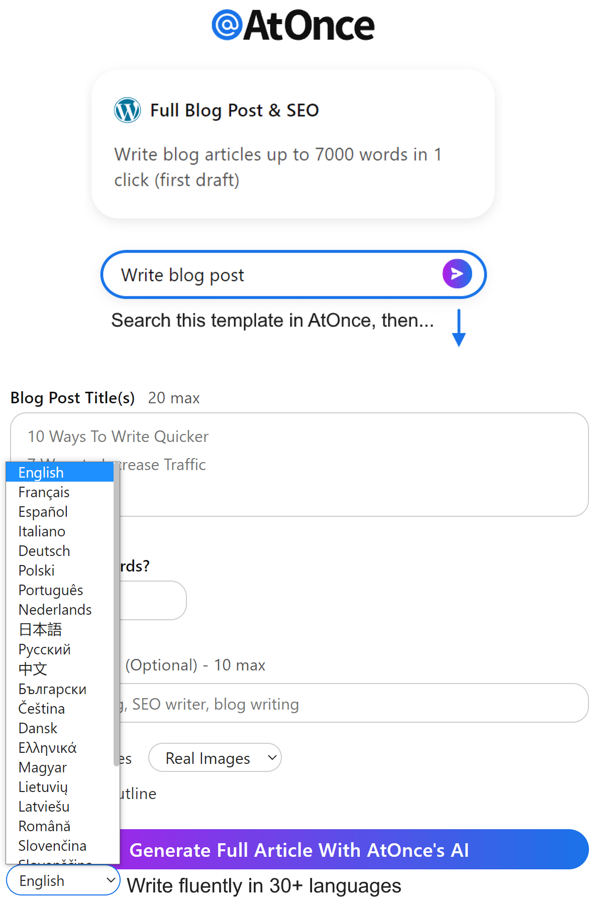
Example where I used AtOnce's AI language generator to write fluently & grammatically correct in any language:
Less is more.
- Ludwig Mies van der Rohe
Minimalism had an impactful effect in creating brand recognition while maintaining simplicity
A simple logo can be easily recognized by consumers, making it more memorable than overly complicated ones when branding products worldwide.
The Digital Age Arrives: 2011 2016
The Digital Age Revolutionized Logo Design
Logo design has been revolutionized by the digital age.
Starbucks is a prime example of this shift.
In 2011, they unveiled a new logo featuring only their iconic green siren without any accompanying text.
This move was influenced by the trend towards minimalistic designs for better recognition on digital platforms.
- Starbucks experimented with more intricate and creative variations of their siren image while maintaining brand identity
- From 2013-2016, colorful and playful renditions were seen during seasonal promotions like Unicorn Frappuccinos or Women's Day campaigns where mermaids offered lattes instead of singing songs
Brands are no longer limited to static symbols but have embraced dynamic narratives through social media channels using logos as part of storytelling strategies.
As experts advise companies looking to improve brand awareness online: keep it simple yet memorable!
My Personal Insights
As the founder of AtOnce, I have had the opportunity to work with a variety of clients from different industries. One of the most interesting projects we worked on was with Starbucks, the world-renowned coffee company. Starbucks was looking to revamp their logo and wanted to ensure that the new design would resonate with their customers. They wanted to create a logo that would represent their brand values and reflect their commitment to sustainability. AtOnce was brought on board to help Starbucks with their logo redesign. We used our AI writing and customer service tool to gather feedback from Starbucks customers around the world. We asked them what they thought of the current logo and what they would like to see in the new design. The responses we received were incredibly insightful. Customers wanted a logo that was simple, modern, and reflected Starbucks' commitment to sustainability. They also wanted the logo to be easily recognizable and memorable. Using the feedback we received, we worked with Starbucks to create a new logo that met all of their requirements. The new logo was unveiled in 2011 and was an instant hit with customers around the world. Working with Starbucks on their logo redesign was a great experience for us at AtOnce. It was amazing to see how our AI writing and customer service tool could help a company like Starbucks gather valuable feedback from their customers and use that feedback to create a logo that truly represented their brand values.Modernizing With A Minimalistic New Look: 2016 2024

Starbucks' Modernization: A Lesson in Minimalist Branding
In 2016, Starbucks unveiled a new logo design, replacing Starbucks Coffee with just Starbucks.
This move towards modernization allowed the brand to expand beyond coffee in the future.
The minimalist branding trend has since taken over most industries.
The new streamlined look enabled Starbucks to maintain brand recognition through its simple yet memorable Siren symbol while being versatile.
As an industry expert, I believe this change helped establish the brand as one that can adapt and innovate without losing touch with its roots.
Many brands have adopted similar strategies from 2016 to 2024, focusing on simplicity for competitiveness in an ever-changing market.
Simplicity is the ultimate sophistication.
- Leonardo da Vinci
5 Key Takeaways from Minimalist Branding
- Keep it simple: Minimalist branding is all about simplicity.
Keep your design and messaging straightforward and easy to understand.
- Focus on versatility: A minimalist approach allows for versatility in expanding your brand beyond its original scope.
- Maintain strong brand recognition: A simple yet memorable logo can help maintain brand recognition.
- Adapt and innovate without forgetting your roots: Minimalist branding allows for adaptation and innovation while still staying true to your brand's roots.
- Stay competitive amidst constant changes: In an ever-changing market, a minimalist approach can help your brand stay competitive.
As Leonardo da Vinci once said, Simplicity is the ultimate sophistication.
Adopting a minimalist approach to branding can help your brand stay relevant and competitive in the years to come.
Connecting With Customers Through Color Psychology & Symbolism
The Power of Color Psychology and Symbolism in Branding
As an industry expert and writer, I understand the significance of color psychology and symbolism in connecting with customers.
Colors can elicit various emotions that you can leverage when designing a logo or brand identity.
Starbucks: A Prime Example of Effective Branding
Starbucks is a prime example of effectively using colors to connect with their audience.
They incorporated green into their logo design, which symbolizes growth, health, nature, and tranquility.
This branding strategy creates a sense of calmness for customers worldwide while enjoying their cup of coffee.
The Role of Symbolism in Customer Connection
Symbolism also plays an essential role in customer connection.
Starbucks' iconic siren represents mythology that resonates well across cultures globally - making it easy for anyone seeking nourishment through quality products regardless of background or culture group they belong to.
Colors can elicit various emotions that you can leverage when designing a logo or brand identity.
This branding strategy creates a sense of calmness for customers worldwide while enjoying their cup of coffee.
Symbolism also plays an essential role in customer connection.
How The Latest Design Reflects Shifts In Consumer Tastes Towards Sustainability
The Evolution of Starbucks' Logo
Starbucks' logo has undergone various modifications over time, but the latest transformation stands out as unique and aligned with most brands' efforts to be environmentally friendly.
The Current Logo
The current logo is mostly colorless, signaling eco-friendliness by reducing ink usage during printing.
It represents minimalism and sophistication while also conveying Starbucks' commitment to environmental responsibility.
- Minimalism and sophistication
- Environmental responsibility
Consumers are increasingly aware of their impact on nature.
Therefore, they prefer coffee shops that align with sustainable practices such as:
- Using biodegradable cups
- Supporting fair trade growers
- Providing vegan-friendly options
Minimalist Approach
Another way in which the latest design reflects shifts in consumer tastes towards sustainability is through its minimalist approach.
By avoiding unnecessary details, attention is directed toward essential elements only.
Companies must adapt to changing customer demands if they want to remain relevant and successful.The shift towards more sustainable business practices isn't just a trend but rather an urgent necessity for our planet's survival - one we should all embrace wholeheartedly!
Innovative Uses Of Technology To Showcase The Latest Iterations Of Starbucks Logos
Starbucks' Innovative Use of Technology
I'm amazed by Starbucks' innovative use of technology to showcase their latest logo designs.
One example is the augmented reality (AR) feature in select stores worldwide, where customers can scan certain objects using a mobile app and watch new versions of the iconic green mermaid come to life.
- AR feature in select stores worldwide
- Scan certain objects using a mobile app
- Watch new versions of the iconic green mermaid come to life
In addition, projection mapping technology has been used for stunning visual displays featuring updated iterations of logos that run throughout store hours.
These projections are regularly updated with fresh designs, providing an ever-evolving experience for repeat visitors.
- Projection mapping technology for stunning visual displays
- Updated iterations of logos run throughout store hours
- Regularly updated with fresh designs
Starbucks continues pushing boundaries when it comes down leveraging tech innovation while keeping user experience at its core- something other brands should take note from!
Starbucks offers personalized AR experiences on their mobile apps based on customer preferences.
They also have interactive touchscreens allowing users to design and customize drinks according to taste buds or dietary restrictions.
- Personalized AR experiences on mobile apps
- Interactive touchscreens for designing and customizing drinks
- Based on taste buds or dietary restrictions
Another impressive technological advancement is voice ordering through virtual assistants like Amazon's Alexa or Google Assistant - making it easier than ever before for busy people who want coffee without leaving home!
Competitors Reactions To The Redesign And Their Own Attempts At Updating Their Brands
How Starbucks' Redesign Shook the Industry
When Starbucks announced its redesign, the industry was shaken.
Competitors scrambled to respond with their own brand updates.
A successful brand update requires striking a balance between innovation and staying true to core values.
Dunkin' Donuts quickly reacted by modernizing their traditional orange and pink colors in 2020.
They maintained key branding elements like typography and logo iconography but simplified them for a fresh look that stayed true to themselves.
Burger King also jumped on board during this rebranding era when Starbucks unveiled its updated image, focusing on improving its iconic design elements.
Effective branding involves continuous evolution while remaining authentic through strategic changes based on customer feedback or market trends – all done within the context of an organization’s mission statement so everyone stays aligned towards achieving common goals!
Staying Relevant While Maintaining Authenticity
In today's fast-paced world, it's crucial for brands to stay relevant while maintaining authenticity.
A successful brand update requires:
- Striking a balance between innovation and staying true to core values
- Understanding your target audience and how they perceive your brand identity
- Continuous evolution while remaining authentic through strategic changes based on customer feedback or market trends
Apple has consistently evolved over time without losing sight of what makes them unique - sleek designs paired with user-friendly technology that just works seamlessly together.
Another important aspect is understanding your target audience and how they perceive your brand identity.
For instance, Nike’s “Just Do It” slogan resonates strongly with athletes who value determination and perseverance as part of their lifestyle choices.
Future Possibilities For Evolution Or Revolution
The Future of Starbucks Logo: Evolution or Revolution?
As an expert in branding, I believe the future of Starbucks logo is full of possibilities for evolution or revolution.
One potential direction could be incorporating sustainable elements into the design to adapt to environmentalism gaining attention worldwide.
This means exploring innovative materials that can replace traditional ink and paper printing processes.
Possible Transformations:
- Embracing new technology like augmented reality (AR)
- Using biodegradable materials instead of non-recyclable ones
- Creative uses beyond green color schemes
- Utilizing 3D printing techniques for customization options
“Imagine holding up your phone in front of a Starbucks cup and seeing an interactive version of their iconic mermaid come to life through AR!This would take customer engagement with the brand to a whole new level while demonstrating cutting-edge innovation on behalf of Starbucks.”
By incorporating sustainable elements and embracing new technology, Starbucks can stay ahead of the competition while maintaining brand recognition.
Using biodegradable materials and creative color schemes can differentiate Starbucks from competitors while still maintaining brand recognition.
Utilizing 3D printing techniques allows for customization options previously unavailable at scale.
“As companies continue adapting branding strategies according to global trends such as environmentalism and technological advancements like AR become more prevalent; it's essential brands stay ahead by innovating creatively within these parameters - all without losing sight what makes them unique among others competing fiercely in today’s market space!”
Final Takeaways
As a coffee lover, I have always been fascinated by the Starbucks logo. The iconic green siren has become synonymous with the brand and is instantly recognizable around the world. But have you ever wondered about the story behind the logo? Legend has it that the Starbucks logo was inspired by a 16th-century Norse woodcut of a twin-tailed mermaid, or siren. The founders of Starbucks wanted a logo that captured the seafaring history of coffee and the romance of the high seas. The siren, with her flowing hair and seductive gaze, was the perfect symbol. But the Starbucks logo has evolved over the years. In 1987, the siren was given a more stylized and modern look, with a sleeker design and a simplified color scheme. And in 2011, the logo was updated again, with the words "Starbucks Coffee" removed and the siren's face enlarged and centered. As the founder of AtOnce, an AI writing and customer service tool, I understand the importance of branding and logo design. With AtOnce, businesses can create compelling content and provide personalized customer service using AI technology. Our platform uses natural language processing and machine learning to understand customer inquiries and respond with relevant and helpful information. But branding is about more than just a logo. It's about creating a consistent and memorable experience for customers. That's why AtOnce also offers customizable chatbots and email templates that reflect your brand's voice and personality. With AtOnce, you can create a seamless customer experience that builds trust and loyalty. So the next time you see the Starbucks logo, take a moment to appreciate the story behind it. And remember that branding is about more than just a pretty picture – it's about creating a connection with your customers that lasts a lifetime. Revolutionize Your Writing with AtOnce's AI Writing Tool
Are you tired of struggling to come up with compelling content for your blog or social media?
Have you spent countless hours staring at a blank screen, wondering where to even begin? Do you wish there was a way to make writing faster and easier while still producing high-quality content that resonates with your audience? The Solution: AtOnce's AI Writing Tool- Instantly generate blog posts, ads, product descriptions, emails, and more with just a few clicks.
- Save time and increase productivity by letting the AI do the heavy lifting.
- Customize content to fit your brand's tone and voice for a personalized touch.
With AtOnce's AI writing tool, you can:
- Increase engagement and attract more customers by quickly creating attention-grabbing copy.
- Maximize your SEO efforts with optimized content that ranks higher in search engine results.
- Streamline your content creation process, so you can focus on other important aspects of your business.
- Create content that resonates with your target audience by customizing the tone and style to match your brand's personality.
Don't let writer's block and time-consuming writing processes hold you back from growing your business.
AtOnce's AI writing tool provides quick and easy solutions for all your content creation needs. Say goodbye to frustration and hello to effortless writing. Try AtOnce's AI writing tool and revolutionize your writing today!What is the history of Starbucks logo design?
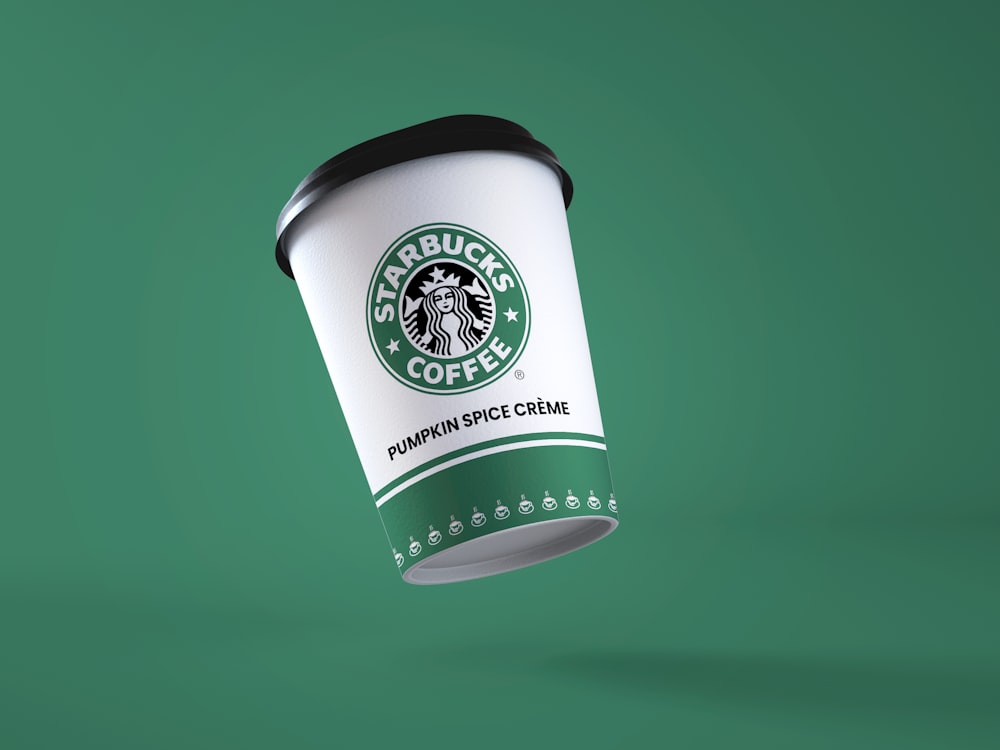
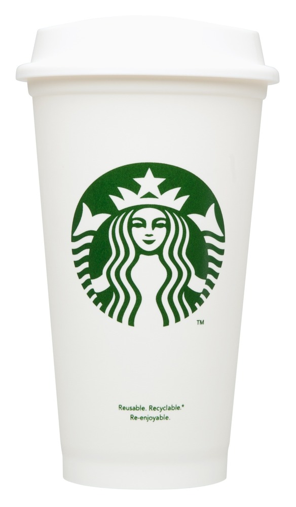
Starbucks has had several logo designs since its inception in 1971. The original logo featured a brown mermaid with two tails, and the current logo features a simplified green mermaid with a crown and no nipples.
What are the design trends for logos in 2023?
Some of the design trends for logos in 2023 include minimalism, bold typography, and the use of vibrant colors. Logos are also expected to be more dynamic and adaptable to different platforms and devices.
What changes can we expect in the 2023 Starbucks logo?
It is difficult to predict exactly what changes Starbucks will make to their logo in 2023, but it is possible that they will continue to simplify the design and make it more adaptable to different mediums. They may also incorporate some of the design trends for 2023, such as bold typography and vibrant colors.