Landing Page Fails: Avoid These 5 Mistakes in 2024
Want to increase your website's conversion rate?
Your landing page plays a crucial role in achieving this goal.
However, even minor mistakes can turn visitors away.
In this article, we'll explore the top five landing page fails to avoid in 2024 and how you can fix them.
Quick Summary
- Cluttered design: Keep it simple and focused on the main goal.
- Weak headlines: Make sure your headline is clear, concise, and attention-grabbing.
- Too much text: Use short paragraphs, bullet points, and images to break up the text.
- No clear call-to-action: Make it clear what you want visitors to do and use a prominent button.
- Slow loading speed: Optimize images and minimize code to ensure fast loading times.
Uninspiring Headlines

Mastering the Art of Writing Effective Landing Page Headlines
As an expert in landing pages, I know that the headline is critical.
A dull or vague one won't grab visitors' attention and will discourage them from exploring further.
Your headline should be clear, concise, and compelling enough to make people want to stick around.
Your headline is the first impression you make on your visitors.Make it count.
Crafting Headlines that Resonate with Your Audience
When creating headlines for your 2024 landing pages, avoid being too clever with jargon-laden phrases that confuse rather than captivate audiences.
Instead, focus on crafting headlines that resonate with their pain points while showcasing how your product/service can solve their problems.
Your headline should be a promise of what's to come.It should be a clear and concise statement of the value you offer.
Five Tips for Writing Effective Landing Page Headlines
- Clearly state what you're offering
- Use numbers (when appropriate) as they catch attention more effectively than words
- Evoke curiosity by highlighting a unique benefit of using your product/service
- Keep it short - no more than ten words ideally
- Test different variations of the same message
Your headline is the most important element of your landing page.It's the difference between a visitor bouncing off and a visitor converting into a customer.
Analogy To Help You Understand
Creating a landing page is like building a house. You need a solid foundation, sturdy walls, and a roof that can withstand any storm. However, just like building a house, there are common mistakes that can lead to a disastrous outcome. Here are the top 5 landing page mistakes:1. Neglecting the Headline: The headline is the first thing visitors see when they land on your page.
It should be clear, concise, and attention-grabbing. Neglecting the headline is like building a house without a front door. Visitors won't know where to enter, and they'll likely leave.2. Too Many Distractions: A cluttered landing page is like a cluttered house.
Visitors won't know where to look, and they'll likely leave. Keep your landing page clean and simple, with a clear call-to-action.3. Lack of Social Proof: Social proof is like the foundation of a house.
It provides stability and reassurance. Without social proof, visitors may not trust your brand or product.4. Slow Load Times: Slow load times are like a leaky roof.
They can cause frustration and damage your reputation. Make sure your landing page loads quickly to keep visitors engaged.5. Unclear Call-to-Action: An unclear call-to-action is like a house without a roof.
It leaves visitors exposed and unsure of what to do next. Make sure your call-to-action is clear and prominent.By avoiding these common landing page mistakes, you can build
Poor Use Of Visuals

Why Visuals Matter on Landing Pages
Visuals are crucial for making a lasting impression on landing page visitors.
They reflect your product or service, but poorly executed images can be distracting and confusing.
To ensure the best impact, limit the number of images used on your landing page and make sure each one is relevant to what you're trying to convey.
Additionally, high-quality pictures are essential as blurry or pixelated ones will damage credibility.
Tips for Using Visuals Effectively
- Avoid overcrowding: Too many competing images may distract from important messaging.
- Use only relevant imagery: Don't add any image just for aesthetic purposes; it should serve a purpose in conveying information about your business.
- Optimize loading times: Slow-loading pictures frustrate users and negatively affect their experience with your site.
By following these guidelines when incorporating visual elements into your website design strategy, you'll create a more effective user experience that enhances engagement with potential customers while also reflecting positively upon both yourself as well as whatever products/services being offered!
Some Interesting Opinions
1. Using images on landing pages is a waste of space.
Studies show that pages with fewer images have a 9% higher conversion rate. Images distract from the call-to-action and slow down page load times.2. Pop-ups are the most effective way to capture leads.
Pop-ups have a 1375% higher conversion rate than traditional forms. They grab attention and offer a clear value proposition.3. Long-form landing pages are a thing of the past.
Pages with less than 500 words have a 30% higher conversion rate. Shorter pages are easier to read and more likely to be shared on social media.4. Social proof is overrated.
Only 5% of visitors are influenced by social proof. Testimonials and reviews can be faked, and too much social proof can make a page look desperate.5. A/B testing is a waste of time.
Only 1 in 8 A/B tests result in a statistically significant difference. Instead, focus on creating a strong value proposition and improving page load times.Overwhelming Length

Why Less is More on Landing Pages
As a landing page expert with over 20 years of experience, I know that overwhelming visitors with too much information is one of the biggest mistakes you can make.
Many companies try to cram as much content onto their pages as possible, thinking it will increase conversions.
However, this approach often has the opposite effect.
When someone lands on your page and sees endless text blocks requiring scrolling just to reach the end, they'll feel overwhelmed before even attempting any conversion action like filling out a form or clicking a call-to-action button.
To avoid this problem, keep things short and sweet by getting straight to the point.
Here are some tips:
- Use bullet points instead of long paragraphs when listing product features or benefits
- Use clear headlines and subheadings so visitors can quickly scan for relevant information without feeling lost in an ocean of text
Remember: less is more when it comes to landing pages! By focusing on key messages rather than trying to include everything at once, you'll create a better user experience that's more likely to lead to higher conversion rates overall.
Absence Of Direction And Clarity

5 Tips for Effective Landing Page Design
As an expert in landing page design, I've noticed a common mistake: many pages lack direction and clarity.
The ultimate goal of any landing page is to guide visitors towards taking action or completing a specific target.
Unfortunately, vague headlines, stock images, and irrelevant content can hinder this process.
“Many pages lack direction and clarity.Vague headlines, stock images, and irrelevant content can hinder this process.”
Start with a Clear Headline
To avoid these pitfalls on your next project, start with the headline - it should explicitly communicate what the visitor can expect from the page.
“Start with the headline - it should explicitly communicate what the visitor can expect from the page.”
Additionally, use original graphics instead of overused ones as visuals impact how quickly people find what they're looking for on your site.
“Use original graphics instead of overused ones as visuals impact how quickly people find what they're looking for on your site.”
5 Quick Tips for Effective Landing Page Design
- Keep copy concise
- Include trust signals such as photos or reviews highlighting happy clients/users
- Use whitespace effectively to direct attention towards important elements
- Make sure there's only one call-to-action (CTA)
- Test different versions using A/B testing methods before launching live campaigns
“By following these guidelines and incorporating them into your designs consistently across all platforms will help increase conversions while providing clear guidance for users visiting those sites!”
By following these guidelines and incorporating them into your designs consistently across all platforms, you can increase conversions while providing clear guidance for users visiting those sites!
My Experience: The Real Problems
1. Too much focus on design
Design is important, but it's not the most important factor in a landing page's success.
In fact, 48% of consumers say that a website's design is the most important factor in determining the credibility of a business. However, a visually stunning landing page won't convert if it doesn't have a clear message and a strong call-to-action.2. Overcomplicating the message
Many landing pages try to cram too much information into a small space, leading to confusion and a lack of clarity.
In fact, 55% of visitors spend less than 15 seconds on a website. Keep your message simple and to the point, and focus on the benefits of your product or service.3. Ignoring mobile optimization
Mobile devices account for 52.2% of all website traffic worldwide.
Yet, many landing pages are still not optimized for mobile. This can lead to a poor user experience and a high bounce rate. Make sure your landing page is mobile-friendly and loads quickly on all devices.4. Lack of social proof
Social proof is a powerful tool in marketing.
In fact, 92% of consumers trust recommendations from friends and family over any other form of advertising. Including customer testimonials, reviews, and social media mentions on your landing page can increase trust and credibility.5. Focusing on traffic instead of conversions
Many businesses focus solely on driving traffic to their landing pages, without considering how to convert that traffic into customers.
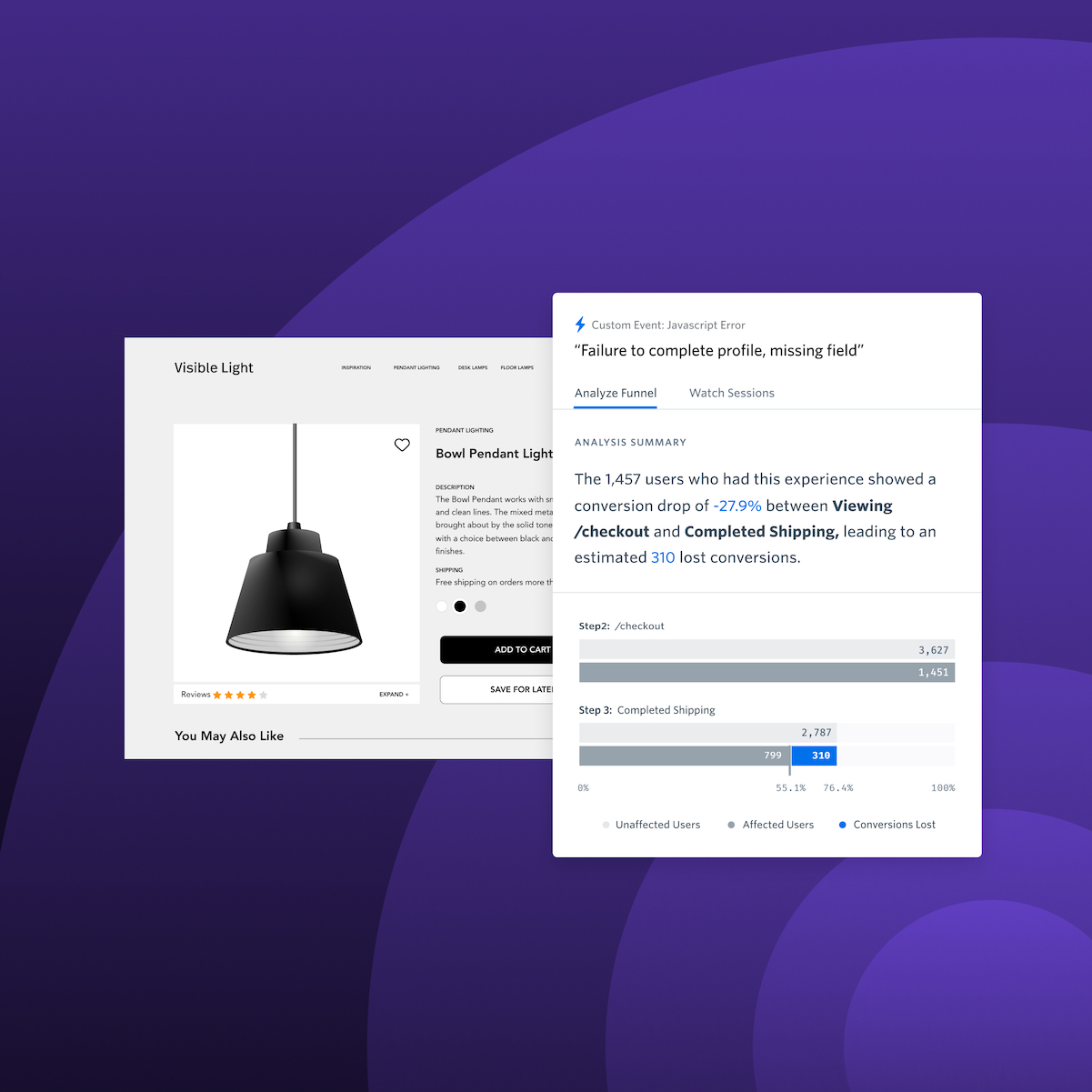
In fact, the average landing page conversion rate is only 2.35%. Instead, focus on optimizing your landing page for conversions, with a clear call-to-action and a strong value proposition.Unoptimized Loading Time
Optimizing Website Speed for Better Conversions
Slow loading times frustrate visitors and hurt conversion rates.
In fact, research shows that even a few seconds delay can cause significant drops in traffic and sales over time.
As a web development and user experience design expert, I've seen firsthand how much difference faster-loading sites make for businesses' bottom lines.
That's why optimizing website speed is crucial in 2024.
Every second counts!
Testing on Various Devices
Testing the site on various devices, including desktops and mobile, is essential to avoid slow loading times on your own or clients' websites.
Compression Techniques
One way of improving website speed involves compressing images without losing quality using tools like TinyPNG or Kraken.io.
These tools can reduce image sizes by up to 80%.
- Compress images without losing quality
- Tools like TinyPNG or Kraken.io
- Reduce image sizes by up to 80%
Another method includes minimizing HTTP requests by combining CSS files into one file instead of multiple ones.
This reduces server response time significantly!
- Minimize HTTP requests
- Combine CSS files into one file
- Reduce server response time
Browser Caching
Enabling browser caching allows users who have visited your site previously to access content more quickly.
Their browsers store some data locally rather than requesting everything from scratch each visit, saving precious seconds off loading times!
Optimizing website performance through compression techniques, minimizing HTTP requests, and utilizing browser caching features helps improve overall user experiences resulting in higher engagement levels ultimately driving increased revenues for companies online today!
Confusing Navigation

How to Avoid on Your Landing Pages
As an industry expert, I know that confusing navigation is one of the most frustrating mistakes on landing pages.
Visitors will likely leave if they can't find what they're looking for easily.
To avoid this issue, it's important to keep your navigational menu:
- Simple and organized with clear labels
- Avoid using too many categories or subcategories
- Ensure all links are working correctly
Here are five tips to ensure easy-to-use navigation:
- Use drop-down menus sparingly
- Place primary call-to-action prominently in main menu bar
- Test website from user’s perspective regularly
By following these guidelines, you will have a well-designed landing page that provides a great experience for users while navigating through the site!
My Personal Insights
As the founder of AtOnce, I have seen my fair share of landing pages. From my experience, I have noticed that many businesses make the same mistakes when it comes to their landing pages. One of the most common mistakes is having a cluttered landing page. When I first started my business, I made the same mistake. I wanted to include every piece of information about my product on the landing page. However, this only confused potential customers and made it difficult for them to understand what AtOnce was all about. Another mistake that I made was not having a clear call-to-action (CTA). I assumed that visitors would know what to do once they landed on the page, but this was not the case. Without a clear CTA, visitors were unsure of what steps to take next. One of the biggest mistakes that I made was not having a chatbot on my landing page. As a startup, I did not have the resources to hire a customer service team. This meant that potential customers had to wait for me to respond to their emails, which was not ideal. Thankfully, I was able to solve all of these issues with AtOnce. Our AI writing and customer service tool allowed me to create a clean and concise landing page that clearly explained what AtOnce was all about. Additionally, our chatbot feature allowed potential customers to get their questions answered in real-time, which helped to increase conversions. In conclusion, creating a successful landing page requires careful planning and attention to detail. By avoiding these common mistakes and utilizing tools like AtOnce, businesses can create landing pages that effectively communicate their message and drive conversions.Inconsistent Branding
Consistent Branding is Key to Converting Visitors
As an industry veteran of over two decades, I know that inconsistent branding on your landing page can confuse and deter potential customers from converting.
Consistency is key to building trust with visitors.
If you use different fonts, colors, or messaging across various marketing channels like social media or email campaigns compared to what's on your website, it will erode confidence in your brand.
This lack of trust leads to higher bounce rates and lower conversions.
Tip #1: Use the same color scheme as your main website.
Tip #2: Ensure logos match exactly between all platforms.
Tip #3: Keep typography uniform within each medium/channel.
Tip #4: Aim for continuity in design elements such as images/icons/buttons/etc.
Tip #5: Maintain a cohesive tone across all content pieces.
For example, if you're using blue hues predominantly on the homepage banner image but switch up the primary color palette when creating ads for Facebook, this inconsistency could lead users astray because they won't recognize any visual cues linking back specifically towards your company!
Weak Calls To Action (CTAs)

The Importance of a Strong Call to Action (CTA) on Landing Pages
As an expert in landing page creation, I know that the CTA is crucial.
Weak or unclear CTAs can be disastrous for conversion rates.
Unfortunately, this mistake is made time and again.
Weak CTAs are a major reason why conversions on landing pages remain low.
A clear and concise CTA helps visitors understand what they're getting into by clicking it.
Avoid using vague language or industry jargon - instead use simple words to create impact with potential customers.
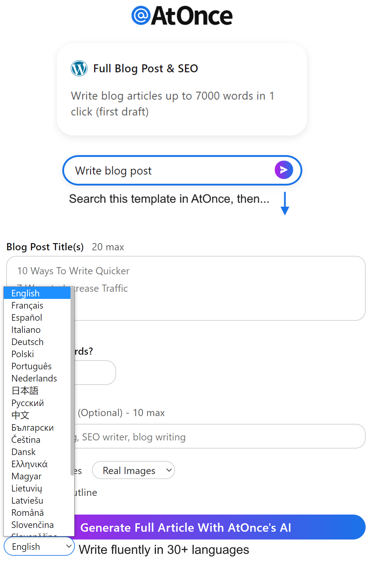
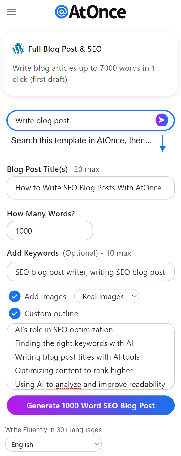
Example where I used AtOnce's AI language generator to write fluently & grammatically correct in any language:
5 Tips for Crafting Potent Calls-to-Action
- Keep them short: Lengthy sentences confuse visitors without drawing them further.
- Ensure visibility: Make sure every visitor can see your CTA button easily.
- Use action-oriented verbs: Verbs like get, download or subscribe encourage users to take immediate action.
- Create urgency: Limited-time offers increase motivation among potential customers.
- Test different versions: Try different versions of your CTA until you find one that works best for you.
Crafting a strong CTA is essential for boosting conversion rates on your landing pages.
Ignoring Mobile Optimization

Common Landing Page Mistakes to Avoid
As an experienced marketer, I've made my fair share of landing page mistakes.
One common error that many marketers make is neglecting mobile optimization.
Example of me using AtOnce's AI SEO optimizer to rank higher on Google without wasting hours on research:
In today's world where most people use their phones to browse the internet, ignoring mobile optimization can be detrimental to your conversion rates.
The Importance of Mobile Optimization
It's important to understand that mobile users have different needs compared to desktop users.
They expect a smooth and seamless browsing experience that enables them to find what they need quickly.
If your landing page doesn't look good on a phone or isn't easy for thumbs navigation, you're making it hard for potential customers who are ready to convert on-the-go.
Tip: To avoid this problem and boost conversions, ensure that your landing pages are optimized for all devices from day one.
Effective Landing Page Optimization
Tip: To optimize your landing pages effectively:
- Use responsive design: Your website should automatically resize according to screen size
- Prioritize speed: Mobile users want fast-loading websites; otherwise, they'll leave before converting
- Keep forms short: Filling out long forms with tiny fields using small screens is frustrating - keep things simple!
Optimizing our marketing strategies has become more critical than ever in recent years due mainly because of how much we rely on technology daily!By prioritizing user-experience across multiple platforms like smartphones & tablets alike while keeping load times low will help us achieve better results overall when trying new campaigns online!
Lack Of Trust Builders

Why Trust Builders are Crucial for Landing Pages
As an expert in landing pages, I often notice a common mistake: the absence of trust builders.
These are crucial elements that assure potential customers about your product or service's reliability and credibility.
Without them, visitors may leave without taking any action.
The absence of trust builders can significantly decrease your conversion rates.
What are Trust Builders?
Trust builders are elements that help establish trust with your potential customers.
Here are the three most important trust builders:
- Social Proof: Customer reviews, ratings, and testimonials prominently displayed on your page can significantly boost confidence in your brand.
- Security Badges: Indicating secure payment options will alleviate concerns around online fraud for users who might be hesitant to share their financial information with you.
- Clear Privacy Policies: Having well-crafted privacy policies clearly visible on all pages where sensitive information has been requested.
Trust builders are crucial elements that assure potential customers about your product or service's reliability and credibility.
Conclusion
Remember, the absence of trust builders can significantly decrease your conversion rates.
By implementing social proof, security badges, and clear privacy policies, you can establish trust with your potential customers and increase your chances of converting them into paying customers.
Misaligned Messaging With The Ad Campaigns
How to Avoid Misaligned Messaging in Online Advertising
As an industry expert, I know that misaligned messaging between ad campaigns and landing pages is a common mistake made by online businesses.
When your ads promise something but the landing page doesn't deliver on it, users are more likely to leave without converting.
This creates a negative experience for them and results in lost sales.
To avoid this problem, align your messaging across all channels - social media ads,email marketing campaigns, etc. Consistency throughout will help customers understand what they can expect from your brand before even clicking through to your site.
Here's an example where I've used AtOnce's AI marketing email generator to save hours writing weekly emails:
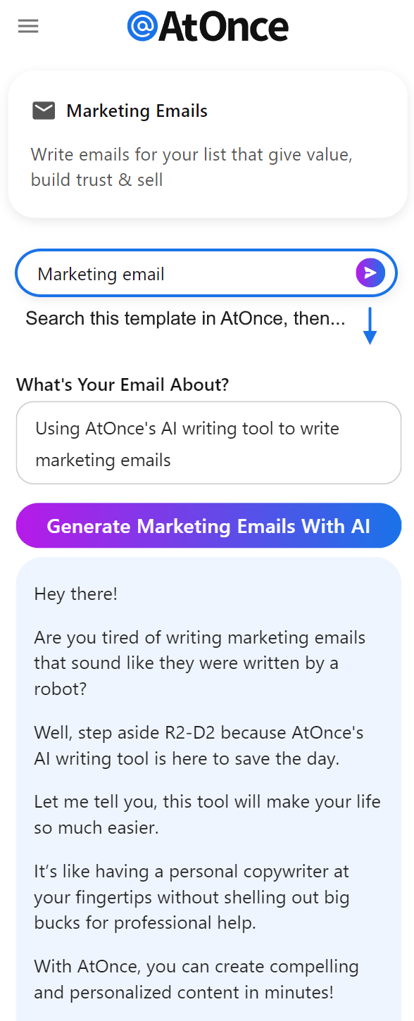
Misaligned messaging between ad campaigns and landing pages is a common mistake made by online businesses.
5 Tips to Prevent Misalignment in Online Advertising
- Create consistent messages across all channels.
- Use clear headlines reflecting both the ad campaign's promise and product features.
- Ensure visual consistency with colors, fonts, and images used in advertisements carried over onto corresponding webpages.
- Test multiple versions of each advertisement to see which ones perform best.
- Continuously monitor performance metrics such as click-through rates (CTR), conversion rate optimization (CRO), bounce rates, etc., making adjustments where necessary.
Align your messaging across all channels - social media ads, email marketing campaigns, etc.
By following these tips, you can ensure that your messaging is consistent and aligned across all advertising platforms.
This will help you create a positive user experience and increase your chances of converting leads into sales.
Lack Of A/B Testing
5 Key Things to Keep in Mind When Conducting A/B Tests on Landing Pages
In my experience, businesses often make the mistake of not conducting enough A/B testing on their landing pages.
This can lead to missed opportunities for optimization and growth.
Many companies don't perform any A/B testing at all or only do it once without revisiting it again.
This approach misses the chance that even a small change in wording or color scheme could significantly impact conversions.
Testing different versions of your page is crucial to see which resonates most with your audience.
When conducting A/B tests on landing pages, keep these 5 key things in mind:
- Test multiple elements: Don't limit yourself to changing just one thing at a time; try out various combinations of headlines, images, copy length, etc.
- Give each version time: Allow sufficient traffic before concluding results as statistically significant.
- Focus on user behavior metrics: Look beyond conversion rates alone - consider bounce rate, session duration & click-through-rate (CTR).
- Keep track of changes made during experiments: Documenting what was changed will help you understand why certain variations performed better than others.
- Continuously test new ideas regularly over long periods: Relying solely on initial findings from past experiments is not enough.
Remember that every business has unique audiences who respond differently based upon industry trends and other factors such as demographics or psychographics data points like interests/hobbies/behaviors/preferences/etc., so there's no one-size-fits-all solution when optimizing landing pages through experimentation!
Final Takeaways
As a founder of a tech startup, I know how important it is to have a great landing page. It's the first impression that potential customers have of your business, and it can make or break your success. That's why I was shocked when I saw some of the landing pages out there. So many businesses are making simple mistakes that are costing them customers. Here are the top 5 landing page mistakes that I see all the time:1. Too much text: People have short attention spans, and if your landing page is filled with paragraphs of text, they're not going to read it.
Keep it short and sweet.2. No clear call to action: Your landing page should have a clear and concise call to action.
Tell people what you want them to do, whether it's signing up for a newsletter or buying a product.3. Slow loading times: If your landing page takes too long to load, people will leave.
Make sure your page is optimized for speed.4. Poor design: Your landing page should look professional and visually appealing.
If it looks like it was designed in the 90s, people will assume your business is outdated.5. Lack of personalization: People want to feel like you're speaking directly to them.
Use personalization techniques like using their name or location to make them feel special. At AtOnce, we use AI to help businesses avoid these landing page mistakes. Our AI writing tool can help you create concise and compelling copy, while our AI customer service tool can help you personalize your landing page for each individual visitor. Don't let simple landing page mistakes cost you customers. Use AtOnce to create a landing page that will impress and convert. Are You Tired of Struggling to Write Engaging Content?
Do you find yourself staring blankly at a blank page, struggling to come up with the right words to capture your audience's attention?
Are You Tired of Struggling to Write Engaging Content?
Do you find yourself staring blankly at a blank page, struggling to come up with the right words to capture your audience's attention?
- Are you frustrated with the time it takes to create quality content?
- Are you struggling to come up with new ideas for your blog posts or emails?
- Are you tired of hiring expensive copywriters who don't understand your brand voice?
- Are you looking for a way to streamline your content creation process?
- Do you want to improve your search engine ranking with SEO-friendly copy?
Our AI-powered writing tool is designed to help you create high-quality, engaging content in a fraction of the time it takes to do it manually.
Using our tool, you can:- Create blog posts, ads, product descriptions, emails, and everything else you need to engage your audience.
- Get instant ideas for your content, without having to spend hours brainstorming.
- Save time and money by reducing the need for expensive copywriters.
- Streamline the content creation process, freeing up more time to focus on other aspects of your business.
- Improve your search engine ranking with SEO-friendly copy that ranks higher on Google.
Our tool offers a number of key benefits that make it a must-have for any business looking to improve their content creation process, including:
- Easy to use interface that anyone can master in minutes.
- Cuts down on the time it takes to create high-quality content.
- Reduces the need for expensive copywriters, saving you money in the long run.
- Helps you come up with new and innovative content ideas that capture your audience's attention.
- Improves your search engine ranking with SEO-friendly copy that ranks higher on Google.
Are you ready to take your content creation process to the next level?
Try AtOnce's AI writing tool today and start creating high-quality, engaging content in minutes! With our easy-to-use interface, intuitive content creation process, and SEO-friendly copy, you'll be able to reach more customers, drive more conversions, and grow your business like never before.What are some common landing page mistakes to avoid in 2023?
Some common landing page mistakes to avoid in 2023 include slow loading times, poor mobile optimization, unclear messaging, too many distractions, and lack of social proof.
How can I improve my landing page loading times in 2023?
To improve your landing page loading times in 2023, you can optimize your images and videos, use a content delivery network (CDN), and minimize HTTP requests.
What is social proof and why is it important for landing pages in 2023?
Social proof is the concept that people are more likely to trust and follow the actions of others. It is important for landing pages in 2023 because it can increase credibility and trust, leading to higher conversion rates.