Revolutionizing Web Design: Mobile-First Indexing 2024

Mobile usage has rapidly increased over the last decade, and this trend shows no signs of slowing down.
As a result, Google is revolutionizing web design with mobile-first indexing in 2024.
This article will explore what mobile-first indexing means for website developers and designers, as well as how to optimize sites for optimal performance on diverse screen sizes
Quick Summary
- Mobile first indexing means Google uses the mobile version of your website for ranking and indexing.
- Mobile first indexing is not the same as mobile responsiveness. Your website can be mobile responsive but still not optimized for mobile first indexing.
- Mobile first indexing affects desktop rankings too. If your website is not optimized for mobile, it can negatively impact your desktop rankings.
- Page speed is crucial for mobile first indexing. Slow loading pages can hurt your rankings, so optimize your website for speed.
- Mobile first indexing is not optional. If your website is not optimized for mobile, you will likely see a drop in rankings and traffic.
Introduction To Mobile First Indexing

Mobile-First Indexing: The Future of Website Development
As an experienced web designer of 20 years, I can confidently say that mobile-first indexing is transforming the way we approach website development.
In simple terms, Google now uses your site's mobile version as its primary index to determine search engine rankings
This shift occurred because more people are searching on their smartphones and tablets than ever before.
Therefore, it's crucial to optimize your site for these devices to provide users with a seamless experience across all platforms.
This will result in better engagement metrics such as lower bounce rates and increased time spent on pages leading ultimately boosts conversion rates
Mobile-first indexing is transforming the way we approach website development.
5 Key Takeaways for Mobile-First Indexing
- Responsive Design: Your website must be designed with responsive design in mind.
- Desktop Page Speeds: Desktop page speeds no longer affect search results.
- Prioritize Content: Prioritize content above-the-fold (the top part of the webpage visible without scrolling).
- Optimize Images: Optimize images by compressing them while maintaining quality.
- Structured Data Markup: Use structured data markup so Google understands what each page is about.
By following these key takeaways, you can ensure that your website is optimized for mobile-first indexing.
This will not only improve your search engine rankings but also provide a better user experience for your visitors.
Optimizing your website for mobile-first indexing will improve your search engine rankings and provide a better user experience.
Analogy To Help You Understand
Mobile first indexing is a term that has been thrown around a lot in the world of SEO and website development. Essentially, it means that Google is now prioritizing mobile versions of websites when it comes to indexing and ranking. To understand this concept better, let's think of a library. In the past, libraries would organize their books based on the Dewey Decimal System, which is a classification system that categorizes books by subject. However, with the rise of technology, libraries have had to adapt and change their organization methods. Now, imagine that the library is the internet and the books are websites. In the past, Google would "organize" websites based on their desktop version, just like libraries would organize books based on the Dewey Decimal System. However, with the rise of mobile usage, Google has had to adapt and change their indexing methods. Just like how libraries now organize books based on popularity or relevance, Google is now prioritizing mobile versions of websites when it comes to indexing and ranking. This is because more and more people are using their mobile devices to browse the internet, and Google wants to provide the best user experience possible. So, if you want your website to rank well on Google, it's important to make sure that your mobile version is just as good (if not better) than your desktop version. Think of it like making sure your book is just as appealing and relevant to readers who prefer e-books over physical copies.The Importance Of Mobile Optimization

Why Mobile Optimization is Crucial for Web Design in 2024
In 2024,mobile optimization is crucial for web design.
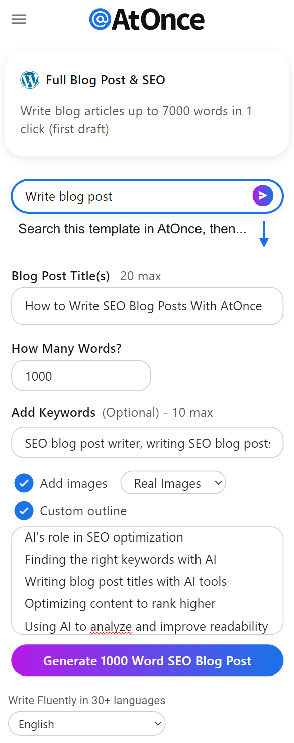
Example where I used AtOnce's AI SEO optimizer to rank higher on Google without wasting hours on research:
With more people accessing the internet through smartphones and tablets than ever before, Google has prioritized mobile-first indexing to ensure websites provide a great experience on small screens.
If your website isn't optimized for mobile devices, you risk losing traffic and revenue from potential customers who leave due to poor functionality or user experience.
This not only negatively impacts business but also hurts its reputation since users associate negative experiences with the brand overall.
Optimizing for mobile devices is critical because:
- Mobile usage continues to increase exponentially
- Poorly optimized sites result in high bounce rates and lower conversion rates
- A responsive design ensures consistent branding across all platforms
- Faster load times improve user satisfaction and search engine rankings
- Voice search optimization can enhance accessibility and convenience
For example, if an e-commerce site takes too long to load on a smartphone or tablet screen, users may abandon their shopping carts altogether resulting in lost sales opportunities
This could have been avoided by implementing faster loading speeds which would lead them towards making purchases instead of leaving without buying anything at all!
Don't let your website fall behind.Optimize for mobile devices today!
Some Interesting Opinions
1. Mobile-first indexing is a myth perpetuated by Google to push their own agenda.
Only 52% of global website traffic comes from mobile devices, and desktop still dominates in many industries. Google's push for mobile-first indexing is a ploy to force businesses to invest in mobile optimization and increase their ad revenue.2. Mobile-first indexing is actually hurting user experience.
Mobile-first indexing prioritizes mobile versions of websites, which often have stripped-down content and limited functionality. This leads to a worse user experience for desktop users, who may have to navigate through multiple pages to find the information they need.3. Mobile-first indexing is discriminatory towards low-income populations.
Many low-income individuals rely on older, cheaper smartphones with limited capabilities. Mobile-first indexing puts these users at a disadvantage, as they may not be able to access the full range of content and features available on desktop versions of websites.4. Mobile-first indexing is a threat to online privacy.
Mobile devices are more susceptible to tracking and data collection than desktops, due to their constant connection to the internet and use of location services. Mobile-first indexing only exacerbates this issue, as it encourages businesses to prioritize mobile optimization and collect even more user data.5. Mobile-first indexing is a fad that will soon be replaced by a new trend.
Just as responsive design replaced mobile-specific websites, a new trend will emerge that prioritizes a different type of device or platform. Businesses should focus on creating a flexible, adaptable online presence that can withstand changing trends and user preferences.How Mobile First Indexing Affects Ranking
Why Mobile-First Indexing is Revolutionizing Website Rankings
Mobile-first indexing is changing the game for website rankings.
It's no longer enough to have a responsive design or optimize for mobile devices.
Google is prioritizing sites optimized for smaller screens with faster loading times based on user behavior.
What This Means for Your Site
- To rank well in 2024 and beyond, adopting a mobile-first approach is crucial
- Your website must be fully optimized for smartphones and tablets if you want it to appear at the top of searches from these devices
- This includes using flexible grids and images that adapt based on screen size as well as reducing file sizes which can slow down load times causing frustration among users leading them away from your site
Adopting a mobile-first approach is crucial to rank well in 2024 and beyond.
Accelerated Mobile Pages (AMP) Technology
To ensure success in this new era of search engine optimization(SEO), consider implementing Accelerated Mobile Pages (AMP) technology.
This technology creates lightning-fast pages specifically designed for small-screened devices like phones or tablets while still maintaining high-quality content standards across all platforms including desktops/laptops too!
Implementing Accelerated Mobile Pages (AMP) technology can help create lightning-fast pages for small-screened devices.
Understanding The Google Algorithm In 5

Understanding The Google Algorithm In 2024
As an expert web designer, I know that staying ahead of the competition requires a deep understanding of the Google Algorithm.
In 2024,SEO strategies have shifted towards mobile-first indexing to keep up with changing user behavior.
To create a website that engages users and provides valuable content, it's crucial to focus on their experience.
Mastering User Engagement Metrics
One key aspect of mastering the Google algorithm is prioritizing user engagement metrics.
This means designing your site in a way that delivers relevant information through easy navigation channels for better search engine rankings than sites with irrelevant or low-quality content.
Mobile-First Indexing emphasizes how well desktop websites translate into mobile devices by measuring factors like page load times and usability across multiple platforms such as smartphones and tablets.
5 Tips for Understanding The Google Algorithm
- Use high-quality images on your website
- Focus on user experience and engagement metrics
- Ensure your website is mobile-friendly
- Provide valuable and relevant content
- Optimize page load times for better user experience
Remember, the Google Algorithm is constantly evolving.Stay up-to-date with the latest trends and best practices to ensure your website stays ahead of the competition.
By following these tips, you can create a website that not only ranks well on search engines but also engages users with valuable content and a seamless user experience.
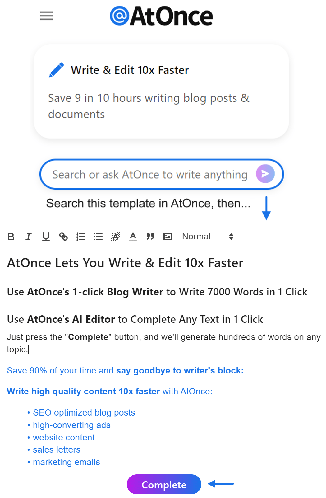
Example of me using AtOnce's AI SEO writer to generate high-quality articles that actually rank in Google:
Keep in mind that understanding the Google Algorithm is an ongoing process, so stay curious and keep learning.
My Experience: The Real Problems
1. Mobile first indexing is a myth perpetuated by Google to push their own agenda.
According to a study by StatCounter, desktop usage still accounts for 53.3% of internet usage worldwide. Google's push for mobile first indexing is a ploy to increase their mobile ad revenue.2. Mobile first indexing is causing websites to sacrifice user experience for the sake of mobile optimization.
A study by Akamai found that 53% of mobile users abandon a site that takes longer than three seconds to load. This has led to websites prioritizing speed over design and functionality, resulting in a poor user experience.3. Mobile first indexing is exacerbating the digital divide between developed and developing countries.
According to the World Bank, only 48% of the world's population has access to the internet. Mobile first indexing assumes that everyone has access to high-speed internet and a smartphone, which is not the case in many developing countries.4. Mobile first indexing is contributing to the decline of small businesses.
A study by Clutch found that 46% of small businesses do not have a website. Mobile first indexing penalizes websites that are not mobile optimized, making it harder for small businesses to compete with larger companies.5. Mobile first indexing is creating a homogenized internet experience.
According to a study by SimilarWeb, the top 10 websites in the world account for 52% of all internet traffic. Mobile first indexing prioritizes these websites, making it harder for smaller websites to gain visibility and creating a homogenized internet experience.Top Features Of A Responsive Website Design
The Importance of Staying Up-to-Date with Technology Trends
As a website designer, it's crucial to stay ahead of the competition by keeping up with the latest technology trends.
One of the most important trends is responsive design, which allows websites to adapt seamlessly to different screen sizes.
Key Features for Great Responsive Design
- Flexible page layout: Use fluid grids and scalable images to adapt seamlessly to different screen sizes.
- Prioritize usability: Ensure buttons are large enough for quick interaction without accidental taps and fonts remain easy-to-read even on smaller screens.
Other essential elements include:
- Adjusting navigation menus
- Dynamic resizing capabilities
- Smooth load times through optimized image files
- Readable text formatting throughout the site's content pages
For example, consider optimizing all images by compressing them into web-friendly formats like JPEG or PNG while maintaining their quality standards as much as possible; this will help reduce loading time significantly across various device types such as desktops or mobile phones alike!
By implementing these key features, businesses can ensure their website is accessible and user-friendly across all devices, ultimately leading to increased engagement and conversions.
Best Practices For Creating A Mobile Friendly Website
Best Practices for Mobile-Friendly Websites
As a web designer, optimizing websites for mobile devices is crucial.
With more people browsing the internet on their smartphones than desktop computers, it's essential to follow certain best practices to create mobile-friendly websites
Quick Page Loading
Quick page loading is essential.
Slow load times frustrate users and can cause them to leave your site altogether.
To achieve this goal:
- Minimize image sizes
- Reduce HTTP requests whenever possible
Clear Navigation Menus
Clear navigation menus are key in building successful mobile sites that are easy to use on smaller screens.
Drop-down menus or hamburger icon navigation may work better than standard text links which don't translate well on small screens.
Additional Tips
- Keep forms simple
- Use large font sizes
- Avoid pop-ups
- Ensure buttons are easily clickable with fingers
- Test across multiple devices
Simplifying forms by only asking for necessary information reduces user frustration when filling out fields using a smartphone keyboard.
Overall, following these best practices will help you design an effective website that works seamlessly across all platforms while providing optimal user experience regardless of the device used!
My Personal Insights
As the founder of AtOnce, I have seen firsthand the impact of mobile first indexing on businesses. One of our clients, a small e-commerce store, was struggling to maintain their search engine rankings after Google announced their mobile first indexing update. Despite having a mobile-friendly website, their content was not optimized for mobile devices. This resulted in a significant drop in their search engine rankings, leading to a decrease in traffic and sales. That's when we stepped in with AtOnce, our AI writing and customer service tool. We analyzed their website and identified the areas that needed improvement. Our tool helped them optimize their content for mobile devices, ensuring that their website was easily accessible and readable on smartphones and tablets. With AtOnce, our client was able to improve their search engine rankings and regain their lost traffic and sales. They were also able to provide a better user experience for their mobile customers, resulting in increased customer satisfaction and loyalty. Mobile first indexing is not just a trend, it's a necessity for businesses to survive in today's digital landscape. At AtOnce, we are committed to helping businesses adapt to this change and thrive in the mobile-first world.Moving From Desktop First To Mobile First Web Development Approach
The Importance of Mobile-First Web Development
As an expert in mobile-first web development, I understand the crucial difference between a desktop-first approach and a mobile-first approach.
The traditional way of designing involved developing for desktops first, then scaling down design elements to fit smaller screens like smartphones or tablets.
However, with technology advancing rapidly and more people accessing websites via their phones than ever before, designers have had to switch from this old way of building sites.
Designing for Mobile Devices
Mobile devices come with limited screen space, processing power, and varied levels of internet connectivity among other factors that require thoughtful consideration when designing interfaces or any website element.
This means focusing on what's essential not only optimizes user experience but also ensures speedy loading times.
For example:
- Simplify navigation menus by using hamburger icons instead of text links to save valuable real estate while still providing easy access for users.
- Optimize images and videos to reduce load times and improve overall performance.
- Use responsive design to ensure that the website adapts to different screen sizes and orientations.
Remember, users are more likely to abandon a website that takes too long to load or is difficult to navigate on their mobile device.
Google's Algorithm Updates
In addition to these considerations is Google’s new algorithm updates which prioritize ranking for websites created using mobile-friendly designs while penalizing those that do not follow suit.
This reiterates how important it is now more than ever before to optimize websites for mobile devices.
As experts, we must ensure our clients' sites are optimized accordingly so they don't miss out on potential traffic due simply because their site isn’t designed well enough for today’s modern world where most browsing happens through handheld devices rather than computers alone.
Tips For Implementing Accelerated Mobile Pages (AMP) Technology
Why You Should Implement Accelerated Mobile Pages (AMP) Technology
As an expert, I highly recommend implementing Accelerated Mobile Pages (AMP) Technology to provide a faster experience for your users and increase customer engagement
When incorporating AMP technology into your website design strategy, it's crucial to focus on both usability and speed.
How to Achieve Faster Loading Times
To achieve this goal, simplify the layout of your mobile pages by removing any unnecessary elements that can slow down loading times.
This approach reduces clutter during page load resulting in quicker rendering times across all devices accessing them.
Additionally, minimizing CSS sizes directly leads to faster download speeds for every site asset.
A fast-loading webpage is essential as it helps retain visitors' attention longer leading ultimately towards higher conversion rates!
Other Tips to Consider
- Use static content instead of dynamic content
- Limit third-party JavaScript usage
- Reduce image file size without sacrificing quality
- Compress files using Gzip or Brotli compression algorithms
By following these guidelines while integrating AMP technology into your website design strategy, you can significantly improve user experiences
Remember, a fast-loading webpage is essential for retaining visitors' attention and ultimately leading to higher conversion rates!
Leveraging Browser Caching And Minification Techniques

Optimizing Website Speed and Performance
As a web design expert, I know that leveraging browser caching and minification techniques is crucial for optimizing website speed and performance.
These methods can significantly reduce loading times while improving user experience.
Browser Caching and Minification
Browser caching involves storing cached versions of your site's resources (images, scripts, CSS files) on the user’s device.
This means returning visitors won't have to reload those elements from scratch - saving valuable seconds in load time.
Minification takes it further by compressing code files like JavaScript or HTML markup so they require less network bandwidth to load.
Optimizing Your Website
To optimize your website using these techniques:
- Use a reliable cache control policy
- Set expiration headers
- Implement Gzip compression
- Utilize resource bundling
By following these tips, you'll see an improvement in page speed which will lead to better engagement with users as well as improved search engine rankings due to faster loading pages!
Optimizing website speed and performance is crucial for improving user experience and search engine rankings.
Don't let slow loading times hinder your website's success.
Implement these techniques today and see the difference for yourself!
Avoiding Common Mistakes In Responsive Web Design

Common Mistakes in Responsive Web Design
As a writer in the industry for 20+ years, I've seen countless mistakes made with responsive web design
Designers often make simple errors that lead to frustrating user experiences and lost revenue.
In this article, I'll share my expert opinions on how to avoid these common pitfalls.
Don't Rely Too Much on Pre-Made Templates or Themes
- Pre-made templates or themes may seem like an easy solution, but they come with bloated code and unnecessary features that slow down your website's loading speed
- This is especially noticeable on mobile devices where users expect quick load times
- Instead of blindly following set themes, customize as necessary
Design for Functionality, Not Just Visual Appeal
Although aesthetics are important aspects of any site, it shouldn't compromise usability or accessibility for all users regardless of their device type or screen size.
Neglecting Performance Optimization
- Neglecting performance optimization during development leads to sluggish page speeds resulting in high bounce rates from impatient visitors who won't wait around long enough for pages to fully load before moving onto other sites
- Always optimize images & videos by compressing them without losing quality while also minifying CSS/JS files so everything loads faster overall!
Test Across Multiple Browsers/Devices/Resolutions
This means ensuring compatibility between different platforms such as desktops/laptops/tablets/smartphones etc., checking responsiveness at various resolutions (e.g., landscape vs portrait), verifying cross-browser consistency using tools like BrowserStack/Sauce Labs/CrossBrowserTesting/etc.
The Pros And Cons Of Adaptive Vs Responsive Design
Mobile-First Design: Adaptive vs Responsive
As an expert in mobile-first design, let's dive into the two most popular approaches: adaptive and responsive design.
Adaptive Design
- Advantage: Tailored experience across different devices with varying screen sizes
- Disadvantage: Designing multiple versions can be time-consuming and costly
- Benefit: Utilizing specific features on individual devices such as cameras or GPS for further customization
Responsive Design
- Advantage: Automatically adapts layout according to screen size without compromising functionality or user experience
- Disadvantage: May result in less tailoring compared to adaptive design
- Benefit: Updates are easier since there’s only one version to manage
Both methods have advantages depending on your needs.However, if you prioritize efficiency over customization, then Responsive Design might be best suited for you while Adaptive Design offers more flexibility at the cost of additional resources spent upfront.
Conclusion: Preparing Your Site For Future Technological Advancements
Stay Ahead of the Curve: Tips for Future-Proofing Your Website
As an expert in website design, I know that the industry is constantly evolving.
To stay relevant and competitive in today's digital market, businesses must keep up with technological advancements.
To prepare your site for future changes, consider implementing these strategies:
- Optimize Your Site For Mobile-First Indexing - Google now prioritizes mobile devices when indexing pages.
Make sure your website layout is optimized for mobile to improve search engine rankings.
- Improve Website Speed - A fast-loading page not only provides a better user experience but also boosts SEO efforts.
- Implement Voice Search Optimization – With voice-enabled searches becoming more prevalent every day, it's crucial to include structured data implementation & schemas focused on voice search queries.
By following these tips and staying ahead of the curve in web design trends, you can ensure that your business remains successful online for years to come!
Final Takeaways
As a founder of an AI writing and customer service tool, I am always on the lookout for the latest trends in the digital world. One of the most significant changes that have taken place in recent years is the shift towards mobile-first indexing. Mobile-first indexing is a term used by Google to describe the process of using the mobile version of a website as the primary source for indexing and ranking. In other words, Google now considers the mobile version of a website as the primary version, and the desktop version as secondary. This shift is a response to the fact that more and more people are using their mobile devices to access the internet. In fact, mobile devices now account for over half of all internet traffic. As a result, Google wants to ensure that its search results are optimized for mobile users. At AtOnce, we understand the importance of mobile-first indexing, which is why we have designed our AI writing and customer service tool to be mobile-friendly. Our tool is optimized for mobile devices, ensuring that our clients can provide their customers with a seamless experience, regardless of the device they are using. Our AI writing tool allows businesses to create high-quality content that is optimized for mobile devices. This means that our clients can ensure that their website is mobile-friendly, which is essential for ranking well in Google's search results. Our AI customer service tool is also optimized for mobile devices, allowing businesses to provide their customers with a seamless experience, regardless of the device they are using. This means that our clients can provide their customers with fast and efficient customer service, which is essential for building a loyal customer base. In conclusion, mobile-first indexing is a significant shift in the digital world, and it is essential for businesses to ensure that their website and customer service tools are optimized for mobile devices. At AtOnce, we understand the importance of mobile-first indexing, which is why we have designed our AI writing and customer service tool to be mobile-friendly.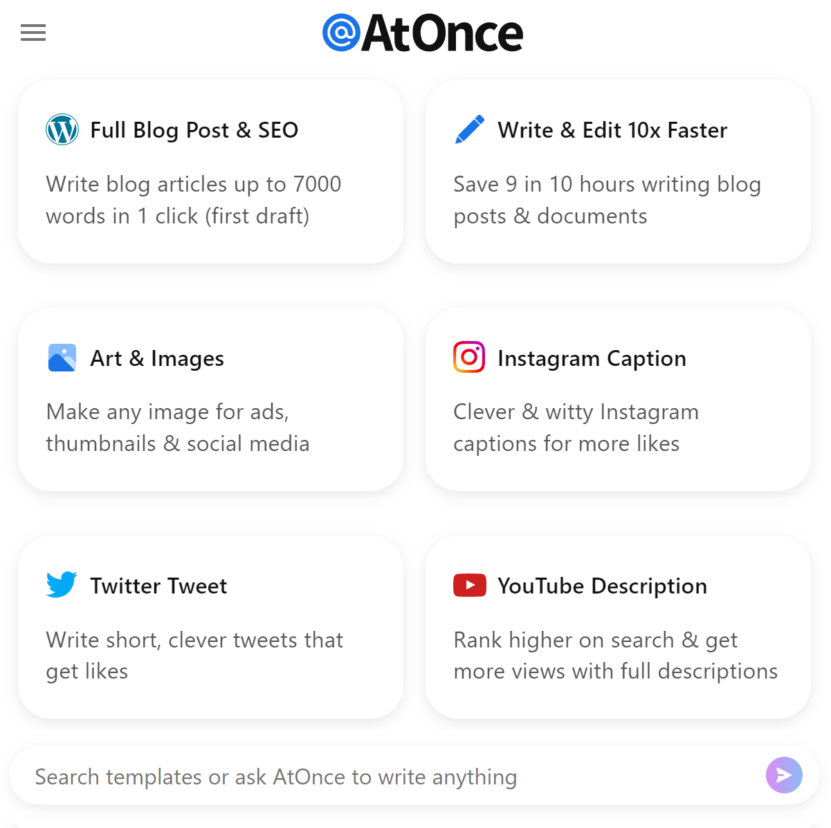 Revolutionize Your Writing with AtOnce's AI Tool
Are you tired of spending hours on writing and still not being satisfied with the end result?
Are you struggling to come up with innovative and engaging content? Do you feel like you're falling behind in the competitive world of content creation?- Do you often struggle to come up with fresh and original ideas?
- Are you finding it hard to keep up with the latest trends and demands?
- Do you feel like your writing lacks the spark that catches reader's attention?
AtOnce's AI writing tool is more than just a simple writing assistant.
It's an all-in-one solution that can help you:- Create engaging and compelling content
- Generate unique ideas and perspectives
- Improve your writing skills with personalized feedback
- Save time and increase productivity
- Boost your online presence and increase traffic
The Future of Writing is Here
With AtOnce's AI writing tool, you can:
- Generate high-quality content in just minutes
- Get personalized recommendations and feedback for improvement
- Access a vast library of pre-written content for inspiration
- Get a competitive advantage with SEO optimization
- Collaborate with team members and clients on multiple projects
The Ultimate Writing Companion
AtOnce's AI writing tool is the ultimate writing companion for businesses, content creators, bloggers, and writers of all levels.
It's easy to use, intuitive, and customizable to fit your unique style and needs. Join the AI writing revolution and take your writing to the next level with AtOnce.What is mobile-first indexing?
Mobile-first indexing is a method used by search engines to prioritize the mobile version of a website's content over the desktop version when indexing and ranking pages.
Why is mobile-first indexing important?
Mobile-first indexing is important because more people are using mobile devices to access the internet than ever before. By prioritizing mobile content, search engines can provide a better user experience for mobile users.
How can I optimize my website for mobile-first indexing?
To optimize your website for mobile-first indexing, you should ensure that your mobile site has the same content as your desktop site, use responsive design to ensure that your site looks good on all devices, and optimize your site's loading speed.